Microsoft Office 2007 Beta 2: User Interface Review
As I mentioned several days ago, Microsoft publicly released the second beta of Office 2007 last week at their WinHEC conference. I, like many of my early-adopting, sneezing peers, raced to download, install and test some or all of the components of the coming Office suite. I wrote that my early impressions were those of amazement. After having spent considerably more time with the suite, my thoughts are the same: Microsoft Office 2007 is going to blow away anything that has come before it. The more I use it, the more I seem to like, maybe even love, about it.
So what has me, and many others long-time Office users I’m sure, so impressed with the next Office offering from Microsoft? User interface. For the first time that I can recall, Microsoft has actually put thought into the user interface. Not only have they put some thought, as well as myriad resources, into the user interface; they’ve delivered some real results, which shows that they’ve gone further than they ever have before to execute on what the users need rather than what they want users to need.
For the sake of brevity, I’ll devote this review to the broad and sweeping changes to the user interface that permeate most of the Office 2007 Beta apps I’ve tested so far. I’ll write app specific reviews separately. As an aside, can anyone tell me what the plan is for apps such as Project 2007 or Visio 2007, which, as of Beta 2, do not implement the new “Ribbon” interface?
Upon starting any of the basic Office apps (Word, Excel, Power Point, Outlook) the user is greeted with an interface that probably looks very foreign to veteran Office users.
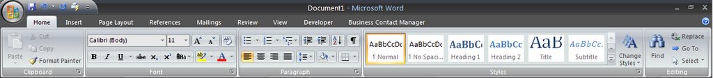
At first glance, it might appear that the Office dev team has simply grouped different functions of different existing toolbars together into buckets below the toolbar. This is partially correct, but there is so much more to the interface that to imply that this is the extent of the changes would be completely missing the point. A closer look at the “Ribbon” interface, as it’s being called my Microsoft, reveals the task-oriented nature of the new interface. While in previous versions of Office, one could wade through menu option upon menu option looking for the appropriate command, the Office team has brought the most pertinent functions to the user based on what they happen to be doing at the time or on the task they want to perform.
For example, when I wanted to insert the above graphic into my writing, I clicked on the “Insert” tab of the Ribbon interface, just as I have down in earlier versions of Office apps. The Ribbon interface then updated to show me the most useful command available to me for inserting an object into the document.
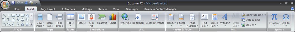
All of the old Insert commands we’ve come to know and love, such as: Shapes, Table, Picture, Clip Art, Chart, Hyperlink, Header and Footer are there. One thing that immediately stands out in the Ribbon interface are the large iconic illustrations that accompany each command. This, in and of itself, is a huge visual improvement over the cascading menus that have plagued recent versions of Office. However, the next example illustrates the simplicity and beauty of the interface created by the Office team. Below is the Ribbon for the Insert command when writing in “blog” mode in Word. (Yes, Office 2007 will include a mode in which users can create, edit and upload blog posts. More on this in the Word 2007 Review).
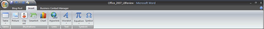
Notice the absence of the Shapes, Pages and Header & Footer groups of commands in the Ribbon? This, of course, is because I can’t insert any of those objects into a blog post. While seemingly simple, and maybe insignificant, this contextually sensitive interface is light years beyond anything Microsoft, or most any company, for that matter, has ever created. It is this simplification of the user experience that I believe so many users will come to appreciate, whether they know it or not.
Of course, each app in the suite has different commands and works slightly differently, which is to be expected considering these applications are still in beta. However, this great turn to usability is one that I have not seen Microsoft take at any time previously with the Office suite. Obviously, there is much, much more to cover in the Office suite. However, I will cover these in the individual application reviews. Needless to say, I am incredibly impressed with the work the Office team has done to create a better experience for the majority of their users and will try to show some of those things in each application review.
Tags:


No comments:
Post a Comment